It’s not uncommon for job seekers to seek out tips and tricks to make their resume stand out. A question that applicants most often ask is, “Should I add color to my resume?”
Some websites will tell you “yes,” that color is advisable. Then detail how to apply the pizzaz to your resume.
We’re here to tell you that color is usually not the answer, even in 2025. The team at ResumeSpice shares some of the top reasons why (and which types of resumes CAN have color).
1. Your resume may be unreadable with color.
There’s simply no font color choice better than black because bright or bold colors can be overwhelming or difficult to read. And since hiring managers only take about seven seconds to review each resume, you don’t want to risk sending an unreadable resume.
Here’s one example of a resume that’s visually difficult to read because of color:
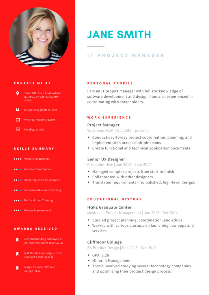
Bright colors on bright colors such as this white font on a red background are visually jarring. You don’t want your resume to be the source of a hiring manager’s migraine! And not only does this resume include a picture – another common resume mistake – it also places a lightly colored font on a white background. This combination makes it difficult for the reader to read.
Bright or dim resume colors also won’t show up when printed by hiring managers. Typically, your resume will be printed on a gray-scale, making a non-black color light or even unreadable. The takeaway? Black and white never go out of style.
2. Avoiding color is more professional.
Adding a touch of personality to a resume can be accomplished, but using purple or red text isn’t the way to achieve it. We recommend letting your accomplishments and your achievements section demonstrate what you bring to the table.
Those sections can help communicate your values, passions, and personality. Employers know this, which is why they look to that section to get a better idea of who you are.
Instead of using color, draw attention to your resume’s contents in other ways. For example, bold your headings. You can also capitalize your headings to make the information stand out even more:
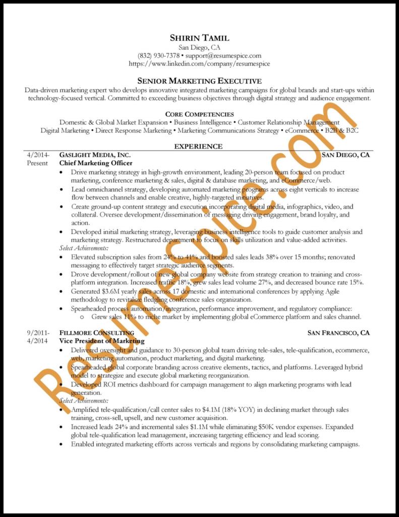
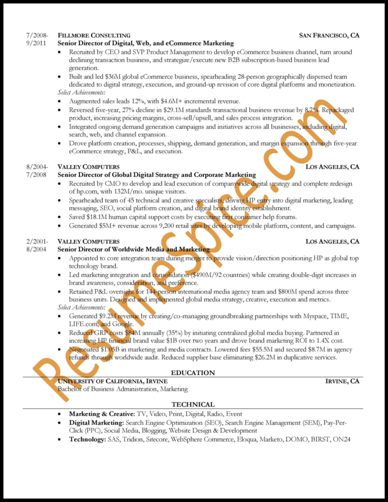
Also, don’t underestimate the power of words. Use powerful action verbs to call attention to your accomplishments and achievements. For example, instead of saying, “Gave the assistance needed to roll out new benefit plans to employees in one day without disruption,” you could say, “Enabled accurate day-one delivery of new benefit plans to employees without disruption.” These strategies, used judiciously, are much more effective than adding colors.
3. Resumes don’t show up the same on different platforms.
We live in an age where everything, from a desktop computer to a watch, can display digital information from all over the world. What does this mean for color on resumes? Your resume may not look the same on your computer as it does on someone else’s device.
Adding color to the background or throughout your document may not translate well to another platform. You may also want to consider what looks best on smaller screens. You want your resume to be easy to read for recruiters and employers.
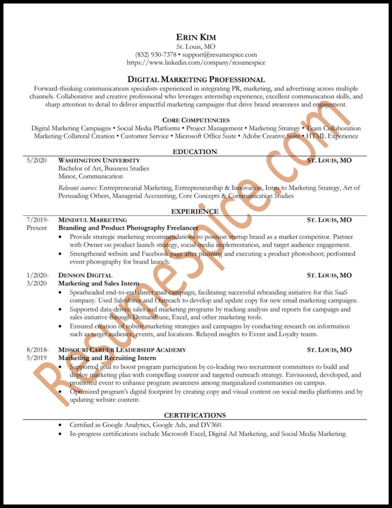
Also, think about Applicant Tracking Systems (ATS). ATS scans instantly recognize the information on black and white resumes. There’s a chance that an ATS won’t recognize bright or dim colors.
An ATS also returns a resume to the hiring manager in black/white. If you use a light text color, your resume information might not show up correctly. With this in mind, why would you want to risk color damaging your chances of a successful ATS scan?
Should I add color to my resume? Only for creative roles.
Color on a resume isn’t always out of the question. It’s a potential option if you’re a graphic designer or in a similar creative role where the design of your resume is a reflection of your skillset.
Here are additional roles where resume color is more acceptable:
- Interior decorator
- Fashion designer
- Floral designer
- Art director
- Actor
- Make-up artist
- Visual artist
- Web developer
- Game artist
- Animator
These roles allow you to demonstrate your creativity and proficiency with certain programs. For example, if you’re applying for an art director position, using the brand’s colors for your resume could show that you’re familiar with their brand guidelines. Or if the position requires you to be an Illustrator whiz, you might design your resume in this program with specific colors.
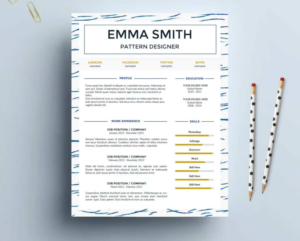
Here’s an example of color appropriately used on a pattern designer resume:
Notice that the colors are not crazy or overwhelming. They instead accentuate the applicant’s skills. This designer also uses a pattern on her resume which matches the job position. But this is the rare exception – for the non-creative professionals, it’s better to stick to black and white (and avoid busy patterns!).
Need more help preparing for your next interview?
Need more help creating a strong resume – let us help! As one of the country’s leading professional resume writing services, ResumeSpice can help you produce a winning resume. Contact us today to learn more at 832.930.7378.


